Post Market Case Study
Designing Experiences that Click
This project involved redesigning an existing website to improve usability, visual hierarchy, and overall user experience. Using Figma, I created wire frames and high-fidelity prototypes, iterating through user feedback to refine navigation, layout, and interactions. The redesign focuses on clarity, accessibility, and a modern aesthetic, ensuring a seamless experience across devices.


The Problem
The goal was to redesign and improve usability, visual hierarchy, and overall user experience. Currently, the website had no organization of it’s vendors, and text over images made it difficult to read information.

The Research
I conducted research on different designs, noted what worked well on these websites and what felt confusing on others. I also paid attention to trends in minimalism, and typography.


User Persona
I redesigned a website with the goal of appealing to people from all walks of life. I kept the design clean, accessible, and easy to navigate, while incorporating modern elements to give it a fresh, up-to-date feel.

Low-Fidelity Design
I conducted research on the subject matter to ensure medical accuracy, while also analyzing how animation could best simplify the information. The strategy focused on balancing clarity with visual appeal, using motion to guide attention and reinforce understanding.


Mid-Fidelity Design
I began designing out low-fidelity wireframes to map the structure and flow of the webpages. This stage focused on layout, hierarchy, and user pathways rather than visuals, allowing me to quickly explore ideas and refine navigation.
By starting simple, I was able to test usability and make adjustments before moving into detailed design.

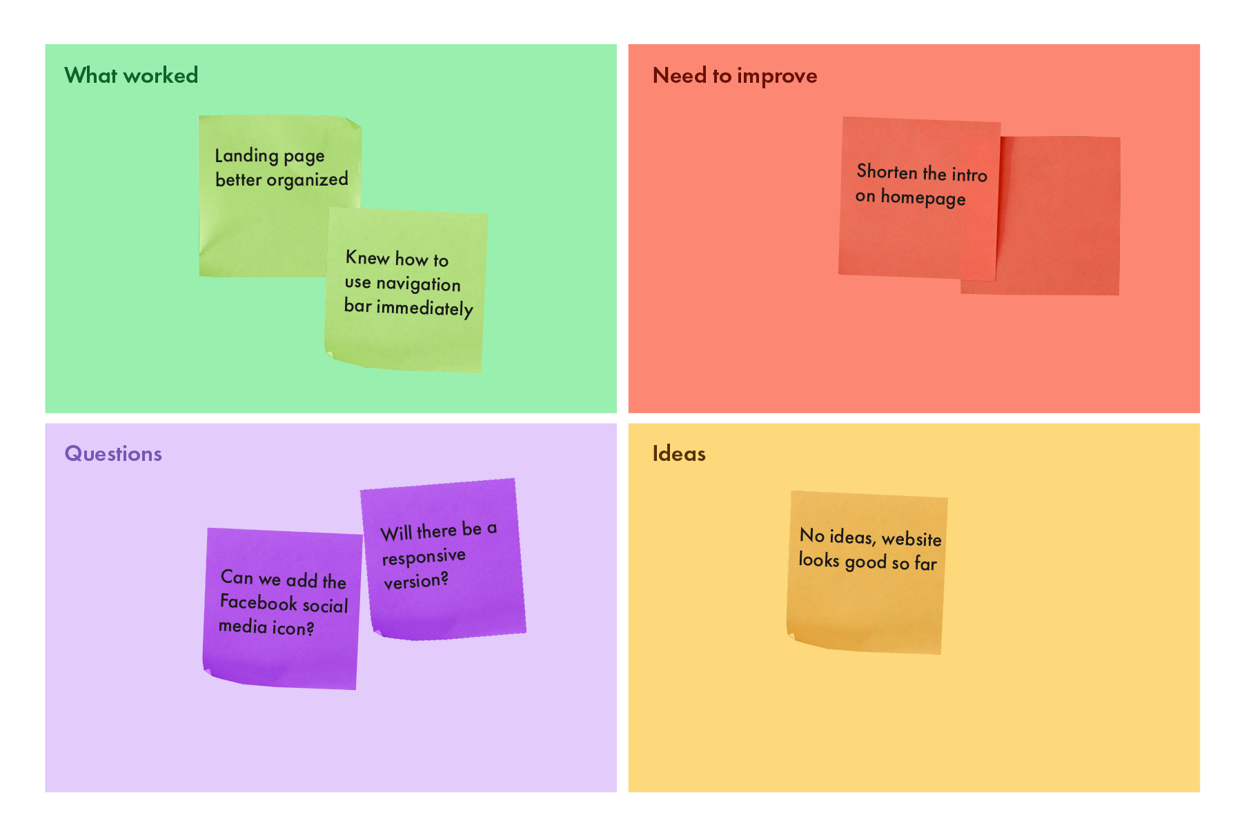
User Feedback
Several tests were ran to establish what had worked and why. I made iterations based on insights from the data