Hermitex Logo Refresh
From Concept Exploration to Refreshed Identity
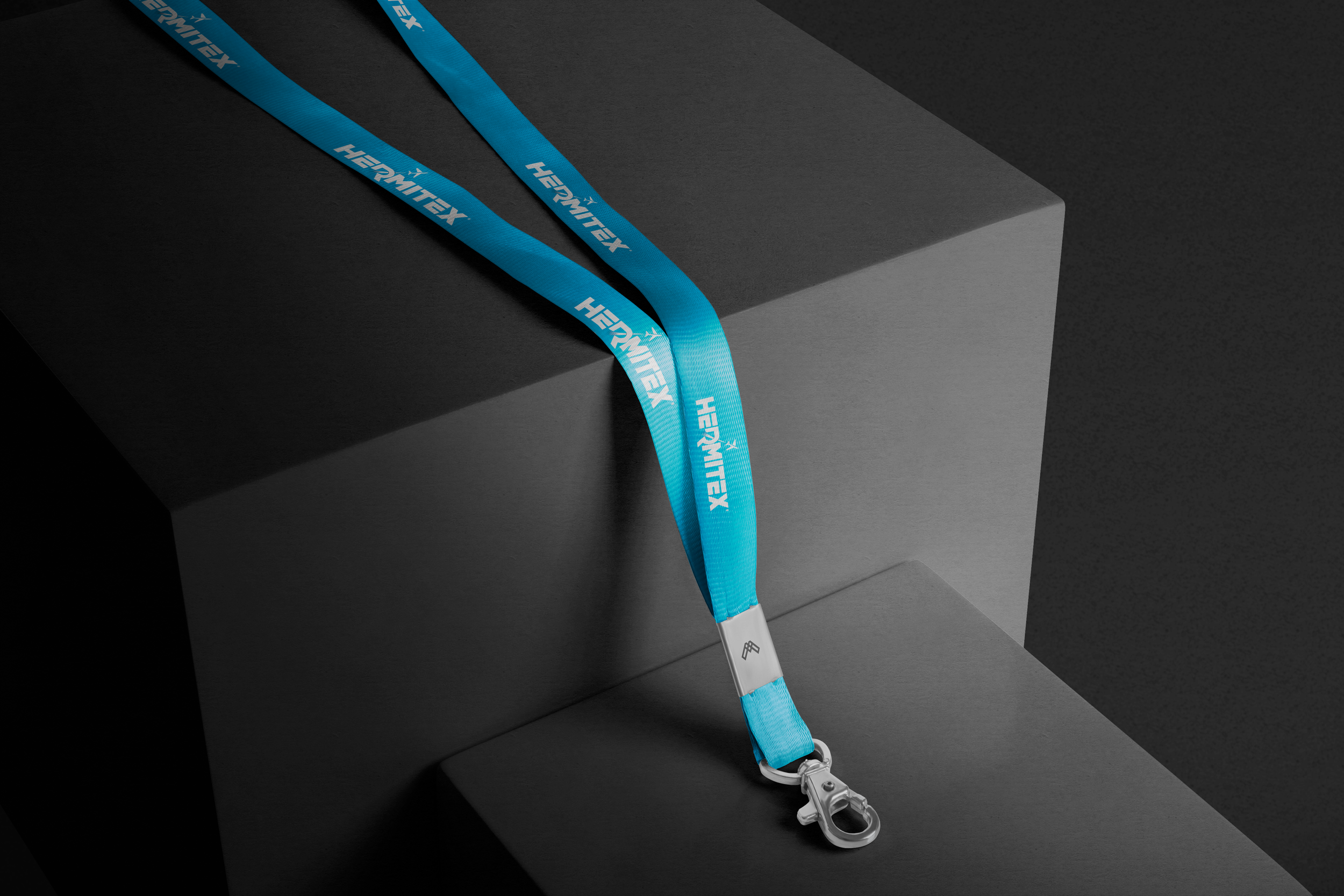
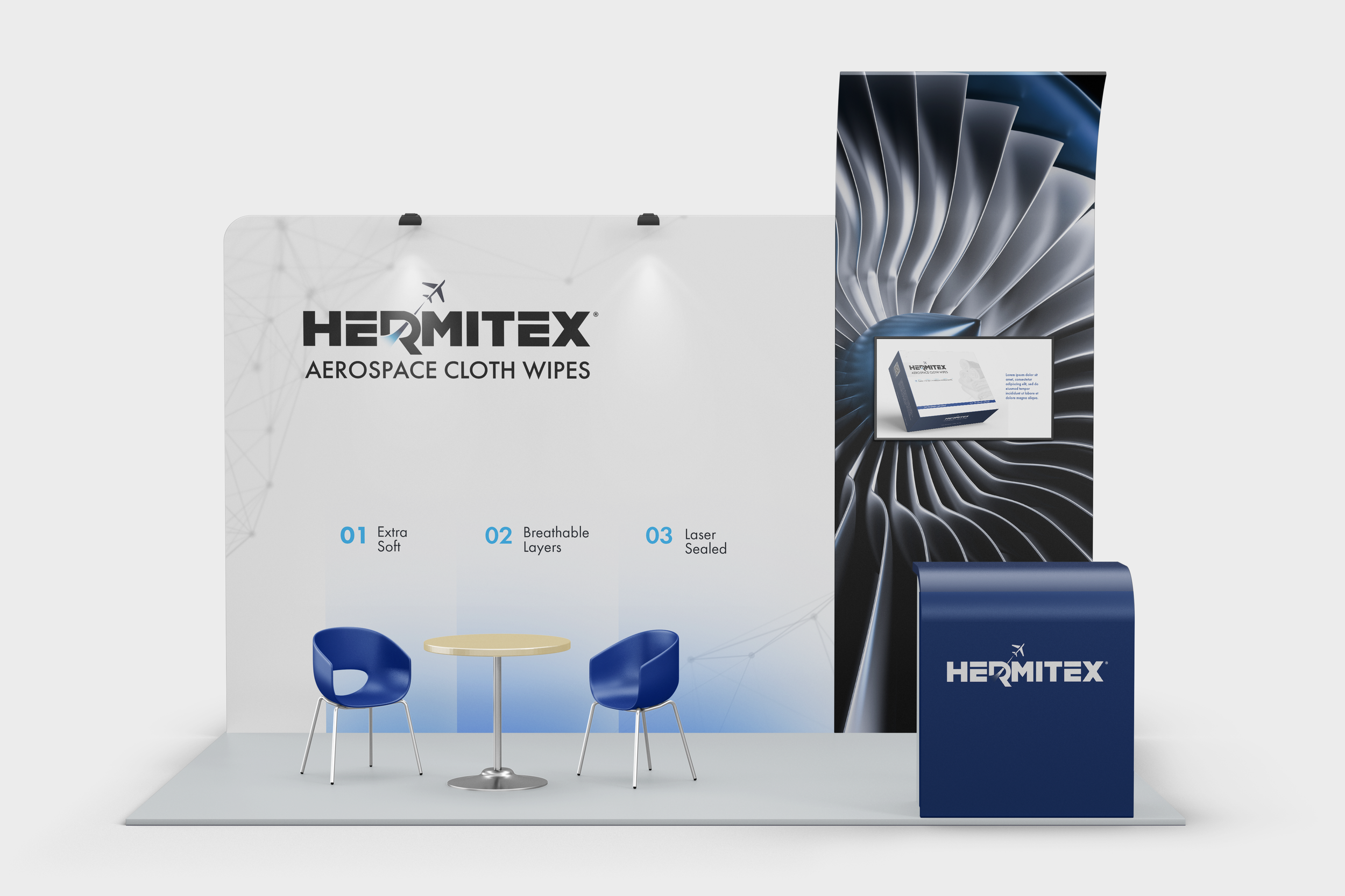
Hermitex has evolved, and so has its logo. The refreshed design honors the brand’s legacy but steps confidently into the future with cleaner shapes, sharper typography, and a bold visual presence. This modern update increases flexibility across digital platforms and strengthens brand impact, giving Hermitex a contemporary look that resonates with today’s audience while staying true to its roots.

Evolution of the Logo
The existing design lacked a cohesive aesthetic, making it difficult for customers to connect with the brand.

Design Rationale
While exploring different concepts, the client requested a logo with an ‘aerospace, futuristic, and clean’ aesthetic, which guided the final design direction.

Merging Ideas & Final Outcome
The client liked the elements from the first two logo ideas. We retained the plane icon but re-positioned it to better integrate with the design, removed the 300, and boldened the font to improve readability.